Exploratory data analysis (EDA) establishes what kind of data we actually have before we test hypotheses or fit models. It tells us how many observations we have, what variables were measured, how much variation is present, whether missing values or outliers need attention, and whether the data contain obvious grouping structure. Poor summaries at this stage usually lead to poor inference later.
In this chapter, I introduce the numerical summaries used at the start of that process. I focus on measures of centre, measures of spread, and a small set of tools for inspecting the structure of a dataset. These summaries work alongside the figures in Chapter 3 and the treatment of distributions and uncertainty in Chapter 4.
1 Key Concepts
The ideas that organise the rest of the chapter are:
EDA: The first analytical pass through a dataset. Its job is to reveal structure, variation, missingness, and potential problems before formal inference begins.
Centre and spread: Most numerical summaries describe either where the data cluster or how widely they vary. They form part of summary (descriptive) statistics.
Distribution: The shape of a distribution determines which summaries describe it well. Symmetric data and skewed data are not best summarised in the same way, and they will be analysed using different tests or models.
Grouped summaries: Biological datasets often contain treatments, species, sites, or times. Summaries by group may reveal structure hidden in pooled data.
2 Foundational Definitions
A few definitions that recur throughout the module are presented next.
2.1 Variables and Parameters
A parameter is a fixed but usually unknown quantity that describes a population or probability distribution. Examples include the true population mean, variance, or regression slope. A variable is the measured characteristic itself: body mass, bill length, temperature, salinity, presence or absence, and so on. We observe variables in a sample and use them to estimate parameters.
2.2 Samples and Populations
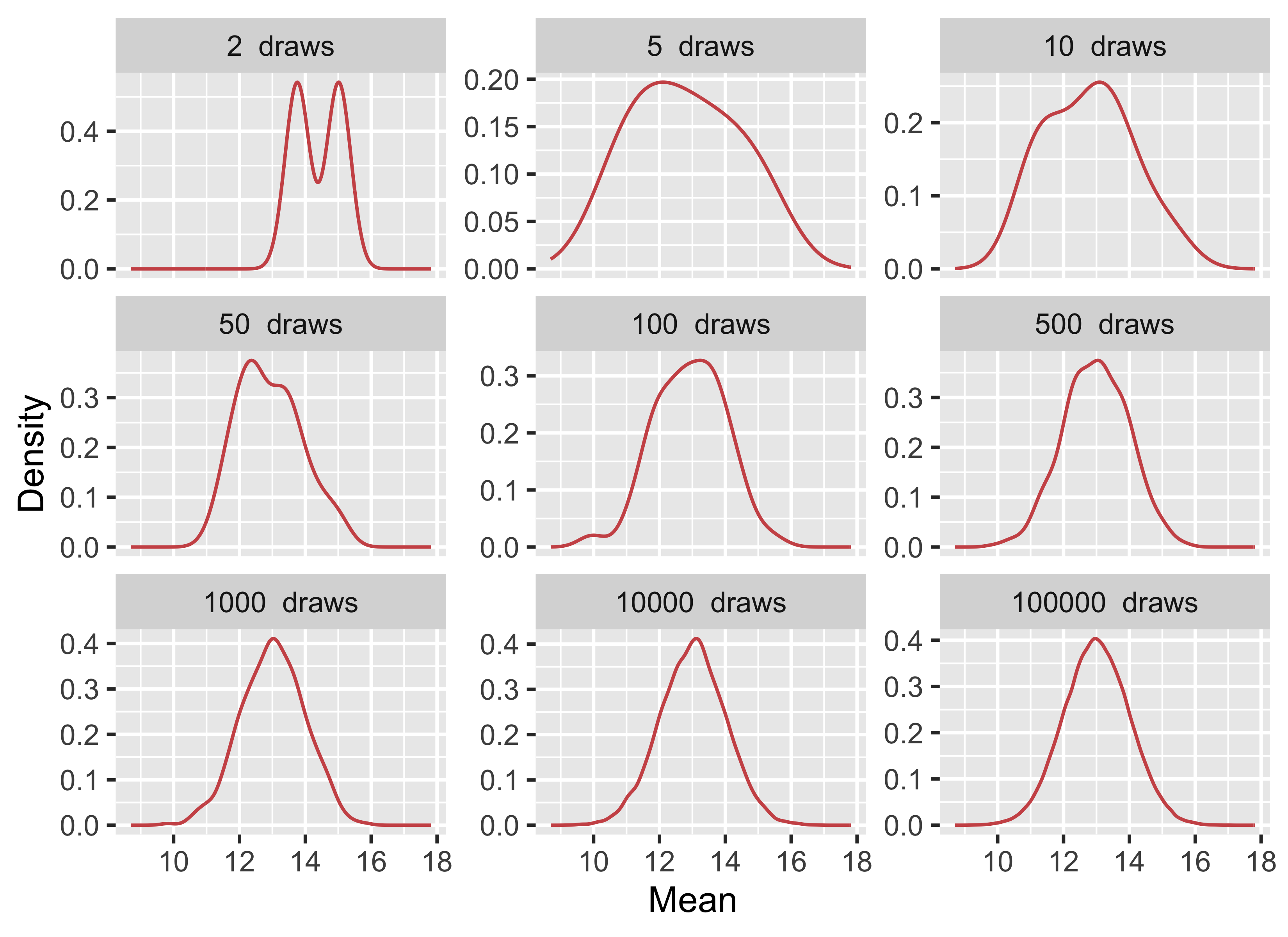
The population is the full set of units about which we want to make a claim: all trees in a forest, all quadrats in a marsh, all fish in an estuary, or all patients in a trial. A sample is the subset we actually measure. Because we rarely have access to the whole population, we rely on a random sample to estimate population-level quantities. The question is therefore whether the sample is informative about the population we care about. As sample size increases, and as the sample better represents the population, the sample mean becomes a more stable estimate of the population mean (Figure 1).
Figure 1: Drawing increasingly larger sample sizes from a population with a true mean of 13 and an SD of 1.
2.3 When Is Something Random?
In statistics, random means that outcomes cannot be predicted exactly in advance, even when the process generating them is understood. Random sampling and random assignment use this idea to reduce bias and to justify probability-based inference.
The term stochastic is closely related but usually refers to a process rather than to a single outcome. Population growth under fluctuating weather, disease transmission, and dispersal all have deterministic components, but they also include variation that is modelled probabilistically. In practice, both terms point us to the same issue: biological systems often contain uncertainty that must be described rather than ignored.
ImportantDo It Now!
Run the code for Figure 1 and compare the panels for 2, 10, and 10 000 draws in terms of their mean and SD. If you forgot the functions, you can find them below. In two or three sentences, explain what changes as sample size increases and why that is important when we use a sample to estimate a population mean.
3 Descriptive Statistics
Now to the summaries used most often in EDA. These summaries answer three basic questions: where is the centre of the data, how much do the values vary, and which summaries remain sensible when the data are skewed or contain outliers.
In Equation 1, \(x_{1}, x_{2}, \ldots, x_{n}\) are the observations and \(n\) is the sample size. The mean is therefore the total of the observations divided by the number of observations.
Equation Equation 2 measures the average squared deviation from the sample mean. The divisor is \(n - 1\) rather than \(n\) because we are estimating population variance from a sample.
The sample standard deviation is the square root of the variance:
\[S = \sqrt{S^{2}} \tag{3}\]
The standard deviation is usually easier to interpret than the variance because it is expressed on the original measurement scale of the data.
For robust summaries, the interquartile range is:
\[\text{IQR} = Q_{3} - Q_{1} \tag{4}\]
In Equation 4, \(Q_{1}\) is the first quartile and \(Q_{3}\) is the third quartile, so the IQR measures the spread of the middle 50% of the data.
3.2 Measures of Central Tendency
Statistic
Function
Package
Mean
mean()
base
Median
median()
base
Mode
Do it!
Skewness
skewness()
e1071
Kurtosis
kurtosis()
e1071
Measures of central tendency describe where the data cluster. The mean and standard deviation work well when the data are roughly symmetric and not dominated by extreme values. The median and IQR are usually better when the data are skewed or contain outliers.
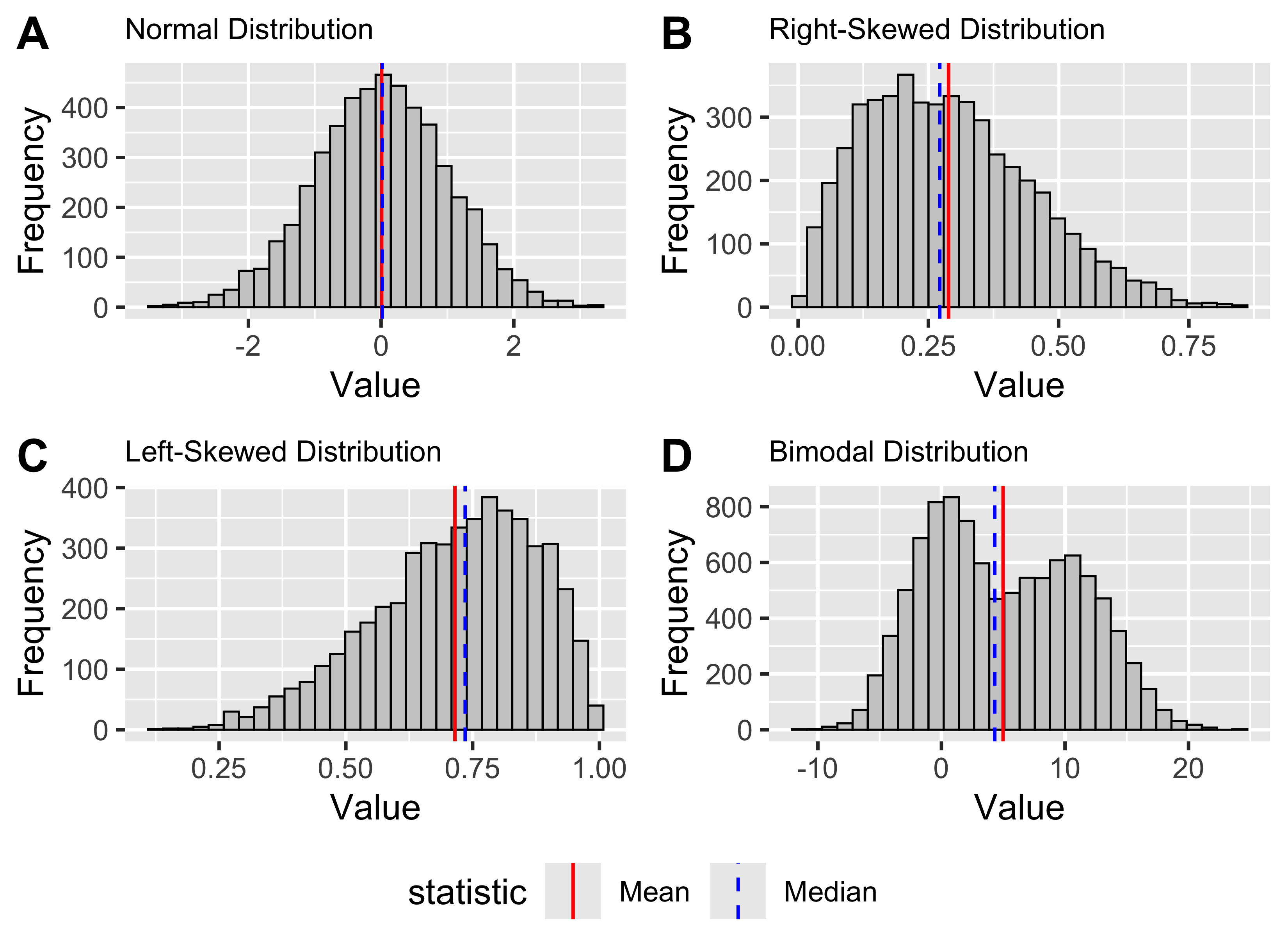
Before discussing each statistic, I will generate several simple datasets with different shapes. These give us a controlled way to compare the summaries.
Show code
# Generate random data from a normal distributionset.seed(666)n <-5000# Number of data pointsmean <-0sd <-1normal_data <-rnorm(n, mean, sd)# Generate random data from a slightly# right-skewed beta distributionalpha <-2beta <-5right_skewed_data <-rbeta(n, alpha, beta)# Generate random data from a slightly# left-skewed beta distributionalpha <-5beta <-2left_skewed_data <-rbeta(n, alpha, beta)# Generate random data with a bimodal distributionmean1 <-0mean2 <-10sd1 <-3sd2 <-4# Generate data from two normal distributionsdata1 <-rnorm(n, mean1, sd1)data2 <-rnorm(n, mean2, sd2)# Combine the data from both distributions to# create a bimodal distributionbimodal_data <-c(data1, data2)make_hist_plot <-function(x, title, fill_col) { stat_lines <-tibble(statistic =c("Mean", "Median"),xint =c(mean(x), median(x)) )ggplot(tibble(value = x), aes(x = value)) +geom_histogram(bins =30, fill = fill_col, colour ="black", linewidth =0.3) +geom_vline(data = stat_lines,aes(xintercept = xint, colour = statistic, linetype = statistic),linewidth =0.5,show.legend =TRUE ) +scale_colour_manual(values =c("Mean"="red", "Median"="blue")) +scale_linetype_manual(values =c("Mean"="solid", "Median"="dashed")) +labs(title = title,x ="Value",y ="Frequency" ) +theme_grey() +theme(legend.position ="bottom",plot.title =element_text(size =9) )}plt_normal <-make_hist_plot(normal_data, "Normal Distribution", "grey80")plt_right <-make_hist_plot(right_skewed_data, "Right-Skewed Distribution", "grey80")plt_left <-make_hist_plot(left_skewed_data, "Left-Skewed Distribution", "grey80")plt_bimodal <-make_hist_plot(bimodal_data, "Bimodal Distribution", "grey80")ggpubr::ggarrange( plt_normal, plt_right, plt_left, plt_bimodal,ncol =2, nrow =2,labels =c("A", "B", "C", "D"),common.legend =TRUE,legend ="bottom")
Figure 2: Generated normal, right-skewed, left-skewed, and bimodal distributions, shown in panels A-D, with the mean and median indicated in each panel.
3.2.1 The Sample Mean
The mean is the arithmetic average of the data. As shown in Equation 1, it is calculated by summing the observations and dividing by the sample size.
We calculate it with mean():
round(mean(normal_data), 3)
R> [1] 0.009
ImportantSelf-Assessment Task 2-1
How would you manually calculate the mean value for the normal_data we generated in the lecture? (/3)
The mean uses all observed values, which makes it informative but also sensitive to skew and outliers. That sensitivity does not make it invalid for non-normal data, but it does make it a poor summary when a few extreme values dominate the result.
In panel A of Figure 2, the normal distribution is centred cleanly around its mean. In panels B and C, tail asymmetry pulls the mean away from the bulk of the data.
3.2.2 The Median
The median is the middle value after the data have been ordered. With an odd number of observations, it is the single central value. With an even number, it is the mean of the two central values.
The median divides the ordered data into two equal halves. In a symmetric distribution it will often be close to the mean. In skewed data it usually gives a more stable description of the centre because extreme values have little influence on it.
That contrast is visible in panels B and C of Figure 2 where the median sits closer to the main cluster of values than the mean does.
We calculate the median with median():
round(median(normal_data), 3)
R> [1] 0.017
It is easier to see the calculation on a small dataset:
set.seed(123) # for reproducibilitysmall_normal_data <-round(rnorm(11, 13, 3), 1)sort(small_normal_data)
Use Figure 2 to decide which measure of centre you would report for each of the four panels. For each panel, write down either mean or median and give one short reason for your choice.
NoteWhat Is the Relationship Between the Median and Quantiles?
The median is the 50th percentile, or second quartile (\(Q_{2}\)). More generally, quantiles divide the ordered data into specified proportions. Quartiles split them into four parts, deciles into ten, and percentiles into one hundred.
3.2.3 The Mode
The mode is the most frequent value or values in a dataset. It is useful for categorical data and for identifying whether a distribution is unimodal, bimodal, or multimodal. For continuous numerical data, exact repeated values are often less informative, so the mode is usually assessed visually from a histogram or density plot rather than calculated directly.
Panel D of Figure 2 shows why visual inspection is useful here: one mean can be calculated, but the figure shows two clear peaks.
Base R does not provide a standard mode() function for this purpose. In practice, visual inspection is often the more useful route.
3.2.4 Skewness
Skewness describes asymmetry in a distribution. A symmetric distribution has skewness close to zero. Positive skewness means the right tail is longer; negative skewness means the left tail is longer.
Skewness is often easiest to understand by comparing the mean and median. In a right-skewed distribution the mean is usually greater than the median. In a left-skewed distribution the mean is usually smaller.
You can see both patterns in Figure 2, where panel B has a longer right tail, and panel C has a longer left tail.
# Is the mean larger than the median?mean(right_skewed_data) >median(right_skewed_data)
R> [1] TRUE
# Negative skewnessskewness(left_skewed_data)
R> [1] -0.5790834
# Is the mean less than the median?mean(left_skewed_data) <median(left_skewed_data)
R> [1] TRUE
3.2.5 Kurtosis
Kurtosis describes tail heaviness relative to a normal distribution. A normal distribution has close to zero kurtosis (called mesokurtic). Negative kurtosis indicates data with a thin-tailed (platykurtic) distribution and positive kurtosis indicates a fat-tailed distribution (leptokurtic).
kurtosis(normal_data)
R> [1] -0.01646261
kurtosis(right_skewed_data)
R> [1] -0.1898941
kurtosis(left_skewed_data)
R> [1] -0.1805365
ImportantSelf-Assessment Task 2-2
Find the faithful dataset and describe both variables in terms of their measures of central tendency. Include graphs in support of your answers (use ggplot()), and conclude with a brief statement about the data distribution. (/10)
Skewness and kurtosis can be informative, but they do not replace visual inspection or later assumption checks. They give a first numerical impression of distribution shape.
3.3 Measures of Variance or Dispersion Around the Centre
Statistic
Function
Variance
var()
Standard deviation
sd()
Minimum
min()
Maximum
max()
Range
range()
Quantile
quantile()
Inter Quartile Range
IQR()
Measures of dispersion describe how widely the values are spread. Two samples can have the same mean but very different biological interpretations if one is tightly clustered and the other highly variable.
3.3.1 Variance and Standard Deviation
Variance and standard deviation are measures of dispersion. The sample variance is given in Equation 2, and the standard deviation in Equation 3. We can calculate them with var() and sd():
var(normal_data)
R> [1] 1.002459
sd(normal_data)
R> [1] 1.001229
ImportantSelf-Assessment Task 2-3
Manually calculate the variance and SD for the normal_data we generated in the lecture. Make sure your answer is the same as those reported there. (/5)
The standard deviation is easier to interpret than the variance because it is measured on the same scale as the data. If temperature is measured in degrees Celsius, the standard deviation is also measured in degrees Celsius.
For roughly normal data, the 68-95-99.7 rule gives a useful approximation: about 68% of observations lie within 1 SD of the mean, about 95% within 2 SD, and about 99.7% within 3 SD (Figure 3).
Figure 3: The idealised Normal distribution showing the proportion of data within 1, 2, and 3SD from the mean.
Like the mean, the standard deviation is sensitive to extreme values. For skewed data or data with strong outliers, the IQR is often more informative.
3.3.2 The Minimum, Maximum, and Range
min(), max(), and range() give the extremes of the data:
min(normal_data)
R> [1] -3.400137
max(normal_data)
R> [1] 3.235566
range(normal_data)
R> [1] -3.400137 3.235566
range() returns the minimum and maximum as a pair. If we want the numerical width of the range, we subtract the minimum from the maximum:
range(normal_data)[2] -range(normal_data)[1]
R> [1] 6.635703
These are simple summaries, but they are often the first place to look for impossible values, obvious outliers, or coding errors.
3.3.3 Quartiles and the Interquartile Range
Quartiles divide the ordered data into quarters. The first quartile (\(Q_{1}\)) marks the point below which 25% of the data fall, the second quartile (\(Q_{2}\)) is the median, and the third quartile (\(Q_{3}\)) marks the point below which 75% fall.
The IQR measures the spread of the middle 50% of the data. Because it ignores the tails, it is much less sensitive to outliers than the standard deviation. It is often the better description of spread for skewed data.
We obtain quartiles with quantile():
# Look at the normal dataquantile(normal_data, p =0.25)
R>        25%
R> -0.6597937
quantile(normal_data, p =0.75)
R>       75%
R> 0.6840946
# Look at skewed dataquantile(left_skewed_data, p =0.25)
R>       25%
R> 0.6133139
quantile(left_skewed_data, p =0.75)
R>       75%
R> 0.8390202
We calculate the IQR with IQR():
IQR(normal_data)
R> [1] 1.343888
ImportantDo It Now!
Calculate the range and IQR for left_skewed_data. The code is just above Figure 2. Then add one very large value to that vector and calculate both summaries again. Which measure changes more, and what does that tell you about when range or IQR is the better description of spread?
ImportantSelf-Assessment Task 2-4
Write a few lines of code to demonstrate that the \((0-0.25]\), \((0.25-0.5]\), \((0.5-0.75]\),\((0.75-1]\) quantiles of the normal_data we generated in the lecture indeed conform to the formal definition for what quantiles are. I.e., show manually how you can determine that 25% of the observations indeed fall below -0.66 for the normal_data. Explain the rationale to your approach. (/10)
The choice between mean and SD on the one hand, and median and IQR on the other, depends on the data. Symmetric distributions are often well described by the first pair. Skewed distributions or data with strong extremes are usually better described by the second.
The contrast among panels A-D in Figure 2 shows why that choice depends on the distribution rather than on habit.
4 The Palmer Penguin Dataset
The Palmer penguin dataset in the palmerpenguins package is a widely used teaching dataset for data exploration, visualisation, and modelling. It contains measurements from three penguin species in the Palmer Archipelago: Adélie, Chinstrap, and Gentoo.
The variables include bill length (bill_length_mm), bill depth (bill_depth_mm), flipper length (flipper_length_mm), body mass (body_mass_g), species, island, and sex. The dataset is rich enough to illustrate grouping structure, missingness, and both numerical and categorical variables without being unnecessarily large.
Let us start by loading the data:
library(palmerpenguins)
5 Exploring the Data Structure
Now we go from statistical definitions to implementation. These functions answer three practical questions: what variables exist, how large the dataset is, and whether the data contain missing values or unexpected structure.
5.1 Inspecting Type and Layout
Several functions give a quick overview of the dataset itself rather than of the values inside it:
Purpose
Function
The class of the dataset
class()
The head of the dataframe
head()
The tail of the dataframe
tail()
Printing the data
print()
Glimpse the data
glimpse()
Show number of rows
nrow()
Show number of columns
ncol()
The column names
colnames()
The row names
row.names()
The dimensions
dim()
The dimension names
dimnames()
The data structure
str()
First, check the class of the object. The penguins dataset is a tibble, which is the tidyverse version of a data frame:
class(penguins)
R> [1] "tbl_df" "tbl" "data.frame"
We can convert between tibbles and data frames with as.data.frame() and as_tibble():
Tibbles do not use row names in the same way as traditional data frames, but row.names() and dimnames() are still worth recognising:
ImportantDo It Now!
Explain the output of dimnames() when applied to the penguins dataset.
ImportantSelf-Assessment Task 2-5
Explain the output of dimnames() when applied to the penguins dataset. (/2)
Explain the output of str() when applied to the penguins dataset. (/3)
5.3 Previewing the Data
head() and tail() let us inspect the first and last rows:
head(penguins)
R> # A tibble: 6 × 8
R>   species island    bill_length_mm bill_depth_mm flipper_length_mm body_mass_g
R>   <fct>   <fct>              <dbl>         <dbl>             <int>       <int>
R> 1 Adelie  Torgersen           39.1          18.7               181        3750
R> 2 Adelie  Torgersen           39.5          17.4               186        3800
R> 3 Adelie  Torgersen           40.3          18                 195        3250
R> 4 Adelie  Torgersen           NA            NA                  NA          NA
R> 5 Adelie  Torgersen           36.7          19.3               193        3450
R> 6 Adelie  Torgersen           39.3          20.6               190        3650
R> # ℹ 2 more variables: sex <fct>, year <int>
tail(penguins, n =3)
R> # A tibble: 3 × 8
R>   species   island bill_length_mm bill_depth_mm flipper_length_mm body_mass_g
R>   <fct>     <fct>           <dbl>         <dbl>             <int>       <int>
R> 1 Chinstrap Dream            49.6          18.2               193        3775
R> 2 Chinstrap Dream            50.8          19                 210        4100
R> 3 Chinstrap Dream            50.2          18.7               198        3775
R> # ℹ 2 more variables: sex <fct>, year <int>
You can wrap them in print() if you want more control over display:
print(head(penguins))
R> # A tibble: 6 × 8
R>   species island    bill_length_mm bill_depth_mm flipper_length_mm body_mass_g
R>   <fct>   <fct>              <dbl>         <dbl>             <int>       <int>
R> 1 Adelie  Torgersen           39.1          18.7               181        3750
R> 2 Adelie  Torgersen           39.5          17.4               186        3800
R> 3 Adelie  Torgersen           40.3          18                 195        3250
R> 4 Adelie  Torgersen           NA            NA                  NA          NA
R> 5 Adelie  Torgersen           36.7          19.3               193        3450
R> 6 Adelie  Torgersen           39.3          20.6               190        3650
R> # ℹ 2 more variables: sex <fct>, year <int>
print(tail(penguins, n =3))
R> # A tibble: 3 × 8
R>   species   island bill_length_mm bill_depth_mm flipper_length_mm body_mass_g
R>   <fct>     <fct>           <dbl>         <dbl>             <int>       <int>
R> 1 Chinstrap Dream            49.6          18.2               193        3775
R> 2 Chinstrap Dream            50.8          19                 210        4100
R> 3 Chinstrap Dream            50.2          18.7               198        3775
R> # ℹ 2 more variables: sex <fct>, year <int>
str() is often the most compact first inspection because it shows object type, variable classes, and a preview of values:
str(penguins)
R> tibble [344 × 8] (S3: tbl_df/tbl/data.frame)
R>  $ species          : Factor w/ 3 levels "Adelie","Chinstrap",..: 1 1 1 1 1 1 1 1 1 1 ...
R>  $ island           : Factor w/ 3 levels "Biscoe","Dream",..: 3 3 3 3 3 3 3 3 3 3 ...
R>  $ bill_length_mm   : num [1:344] 39.1 39.5 40.3 NA 36.7 39.3 38.9 39.2 34.1 42 ...
R>  $ bill_depth_mm    : num [1:344] 18.7 17.4 18 NA 19.3 20.6 17.8 19.6 18.1 20.2 ...
R>  $ flipper_length_mm: int [1:344] 181 186 195 NA 193 190 181 195 193 190 ...
R>  $ body_mass_g      : int [1:344] 3750 3800 3250 NA 3450 3650 3625 4675 3475 4250 ...
R>  $ sex              : Factor w/ 2 levels "female","male": 2 1 1 NA 1 2 1 2 NA NA ...
R>  $ year             : int [1:344] 2007 2007 2007 2007 2007 2007 2007 2007 2007 2007 ...
ImportantDo It Now!
Explain the output of str() when applied to the penguins dataset.
6 Data Summaries
Once we understand the structure of the dataset, we summarise the values it contains. The tools in this section automate the numerical descriptions introduced above.
Use them for slightly different purposes:
summary() for a quick overview of variable types and basic summaries.
skim() for a broader inspection that includes missingness and type-specific summaries.
describe() for more detailed descriptive statistics on numerical variables.
descriptives() and dfSummary() when you want more elaborate tabular output.
Purpose
Function
Package
Summary of the data properties
summary()
base
describe()
psych
skim()
skimr
descriptives()
jmv
dfSummary()
summarytools
6.1summary()
summary() is the standard quick overview in base R. For data frames and tibbles, it reports variable classes and a small set of numerical summaries:
summary(penguins)
R>       species          island    bill_length_mm  bill_depth_mm
R>  Adelie   :152   Biscoe   :168   Min.   :32.10   Min.   :13.10
R>  Chinstrap: 68   Dream    :124   1st Qu.:39.23   1st Qu.:15.60
R>  Gentoo   :124   Torgersen: 52   Median :44.45   Median :17.30
R>                                  Mean   :43.92   Mean   :17.15
R>                                  3rd Qu.:48.50   3rd Qu.:18.70
R>                                  Max.   :59.60   Max.   :21.50
R>                                  NA's   :2       NA's   :2
R>  flipper_length_mm  body_mass_g       sex           year
R>  Min.   :172.0     Min.   :2700   female:165   Min.   :2007
R>  1st Qu.:190.0     1st Qu.:3550   male  :168   1st Qu.:2007
R>  Median :197.0     Median :4050   NA's  : 11   Median :2008
R>  Mean   :200.9     Mean   :4202                Mean   :2008
R>  3rd Qu.:213.0     3rd Qu.:4750                3rd Qu.:2009
R>  Max.   :231.0     Max.   :6300                Max.   :2009
R>  NA's   :2         NA's   :2
ImportantSelf-Assessment Task 2-6
Explain the output of summary() when applied to the penguins dataset. (/3)
6.2psych::describe()
psych::describe() provides a more detailed numerical summary:
Generated by summarytools 1.1.5 (R version 4.5.3) 2026-04-17
No single tool is best in every situation. The important point is to know what each one is for and to use it deliberately rather than mechanically.
7 Descriptive Statistics by Group
ImportantDo It Now!
Before looking at the grouped ChickWeight summaries, identify the variables that define the grouping structure in that dataset. Then propose one grouped table and one grouped figure that would help you compare chicks in a biologically sensible way.
ImportantSelf-Assessment Task 2-7
Why is it important to consider the grouping structures that might be present within our datasets? (/2)
Whole-dataset summaries are only a starting point. Biological data are often structured by species, treatment, site, sex, season, or year, and those groupings are often more informative than the overall mean. Once we acknowledge that structure, the descriptive question changes from “What is the average?” to “Average for whom, under what condition, and with what spread?”
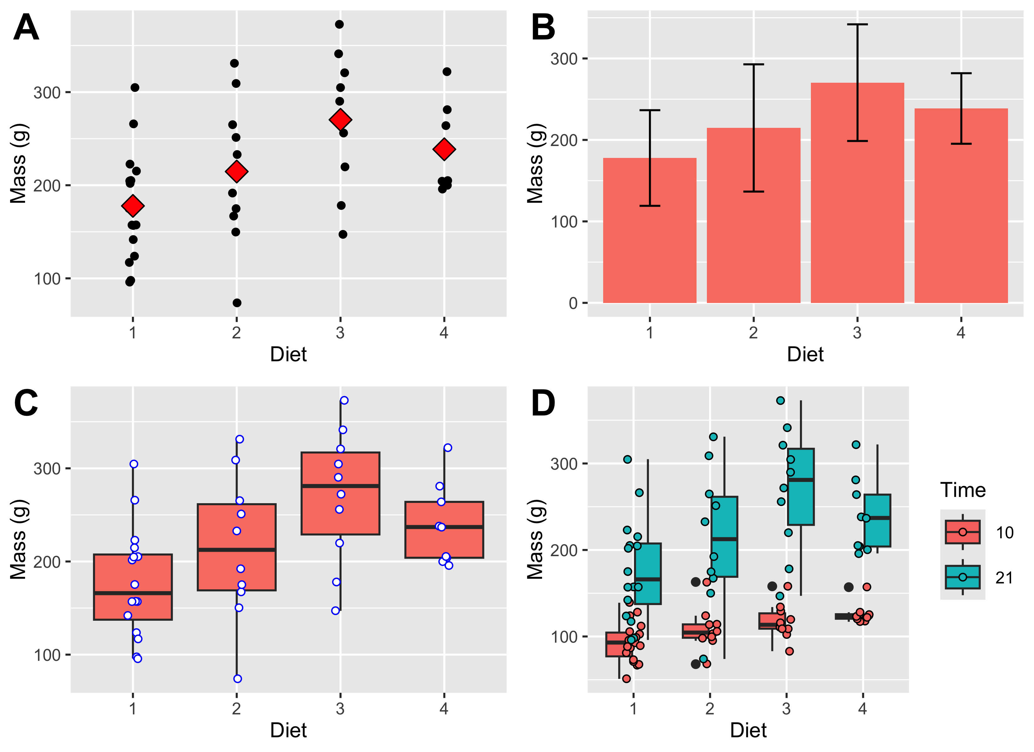
The ChickWeight data make the point clearly. A single mean across all chicks, all diets, and all sampling days hides the fact that the birds were measured repeatedly and assigned to different diets. It is much more informative to summarise weight within diet groups and at specific time points, for example at the start and end of the experiment. That lets us compare means with standard deviations, medians with interquartile ranges, and then relate those numerical summaries to figures that make the group differences visible.
An analysis of the ChickWeights dataset that recognises the effect of diet and time (start and end of experiment) might reveal something like this:
We typically report the measure of central tendency together with the associated variation. So, in a table we would want to include the mean ± SD. For example, this table is almost ready for including in a publication:
Diet
Time
Mean ± SD
1
0
41.4 ± 1
1
21
177.8 ± 58.7
2
0
40.7 ± 1.5
2
21
214.7 ± 78.1
3
0
40.8 ± 1
3
21
270.3 ± 71.6
4
0
41 ± 1.1
4
21
238.6 ± 43.3
Table 1: Mean ± SD for the ChickWeight dataset as a function of Diet and Time.
Further, we want to supplement this EDA with some figures that visually show the effects. Here I show a few options for displaying the effects in different ways: Figure 4 shows the spread of the raw data, the mean, median or as well as the appropriate accompanying indicators of variation around the mean or median. I will say much more about using figures in EDA in Chapter 3.
Figure 4: The figures represent A) a scatterplot of the mean and raw chicken mass values; B) a bar graph of the chicken mass values, showing whiskers indicating 1 ±SD; C) a box and whisker plot of the chicken mass data; and D) chicken mass as a function of both Diet and Time (10 and 21 days).
8 Reporting
We want to communicate our EDA in a report or publication. Here is how we would typically do it:
NoteWrite-Up
Methods
Chicken body mass was summarised descriptively by diet group at the start of the experiment (Time = 0) and again at day 21. Group means, standard deviations, and sample sizes were calculated, and complementary figures were used to visualise the spread of raw observations within each diet.
Results
At the start of the experiment, mean body mass was similar across diets (about 41 g in all four groups). By day 21, mean mass had increased in every diet group, but the increase differed among diets: Diet 3 had the highest mean final mass (270.3 ± 71.6 g SD, n = 10), followed by Diet 4 (238.6 ± 43.3 g, n = 9), Diet 2 (214.7 ± 78.1 g, n = 10), and Diet 1 (177.8 ± 58.7 g, n = 16). The grouped summaries and figures therefore suggest a strong diet-related difference in final body mass, with Diet 3 producing the heaviest chicks in this descriptive comparison.
Discussion
This is still a descriptive result rather than a formal inferential test, but it shows what grouped summaries reveal. Once the data are split by diet and time, biologically important differences become visible that would be hidden in a single overall mean.
ImportantDo It Now!
Select your favourite three conitnuous variables in the BCB7342 field trip set of data. Assess the grouping structure, and apply a full set of descriptive analyses. Describe your data’s distribution in the light of your finding, and provide visual support.
9 Conclusion
Numerical summaries are the starting point for any serious data analysis. Measures of centre tell you where a distribution sits; measures of spread tell you how uncertain that location is; quantiles and structure-inspection tools tell you whether the data meet the assumptions you will rely on in later tests. None of these summaries is informative in isolation. For example, a mean without a measure of spread is incomplete, and a spread without context for the sample size can also be misleading. Used together, and always computed within the grouping structures that the study design imposes, they give you a first account of what your data contain.
The numerical summaries covered here are, however, only one half of exploratory data analysis. Tables of means and standard deviations alone can hide the shape of a distribution, mask outliers, and obscure the relationships between variables. Chapter 3 extends the picture by turning exploratory data analysis into graphical evidence. In that chapter, I will show you how to choose the right plot for each type of question and how to communicate your findings in a form that a scientific audience can immediately interpret.