11. Faceting Figures

![]()
“If a graph is worth a thousand numbers, a good graph is worth a thousand bad tests.”
— Edward Tufte
“You miss 100% of the shots you do not take.”
— Wayne Gretzky
So far we have only looked at single panel figures. But as you may have guessed by now, ggplot2 is capable of creating any sort of data visualisation that a human mind could conceive. This may seem like a grandiose assertion, but we will see if we cannot convince you of it by the end of this course. For now however, let us just take our understanding of the usability of ggplot2 two steps further by first learning how to facet a single figure, and then stitch different types of figures together into a grid. In order to aid us in this process we will make use of an additional package, ggpubr. The purpose of this package is to provide a bevy of additional tools that researchers commonly make use of in order to produce publication-quality figures. Note that library(ggpubr) will not work on your computer if you have not yet installed the package.
1 When to Facet, Overlay, or Grid
Before we write code, we need a simple decision rule:
- Facet when you want to compare subgroups within the same coordinate system and scales (e.g., 0 m vs 200 m, or temperature vs oxygen).
- Overlay when the comparisons are most meaningful in a single panel (e.g., two groups sharing one trend line).
- Grid when you want to compare different summaries or perspectives side-by-side (e.g., time series, histogram, and boxplot together).
If you need shared scales and legends across panels, plan the composition early. It is easier to align meaning first and code second.
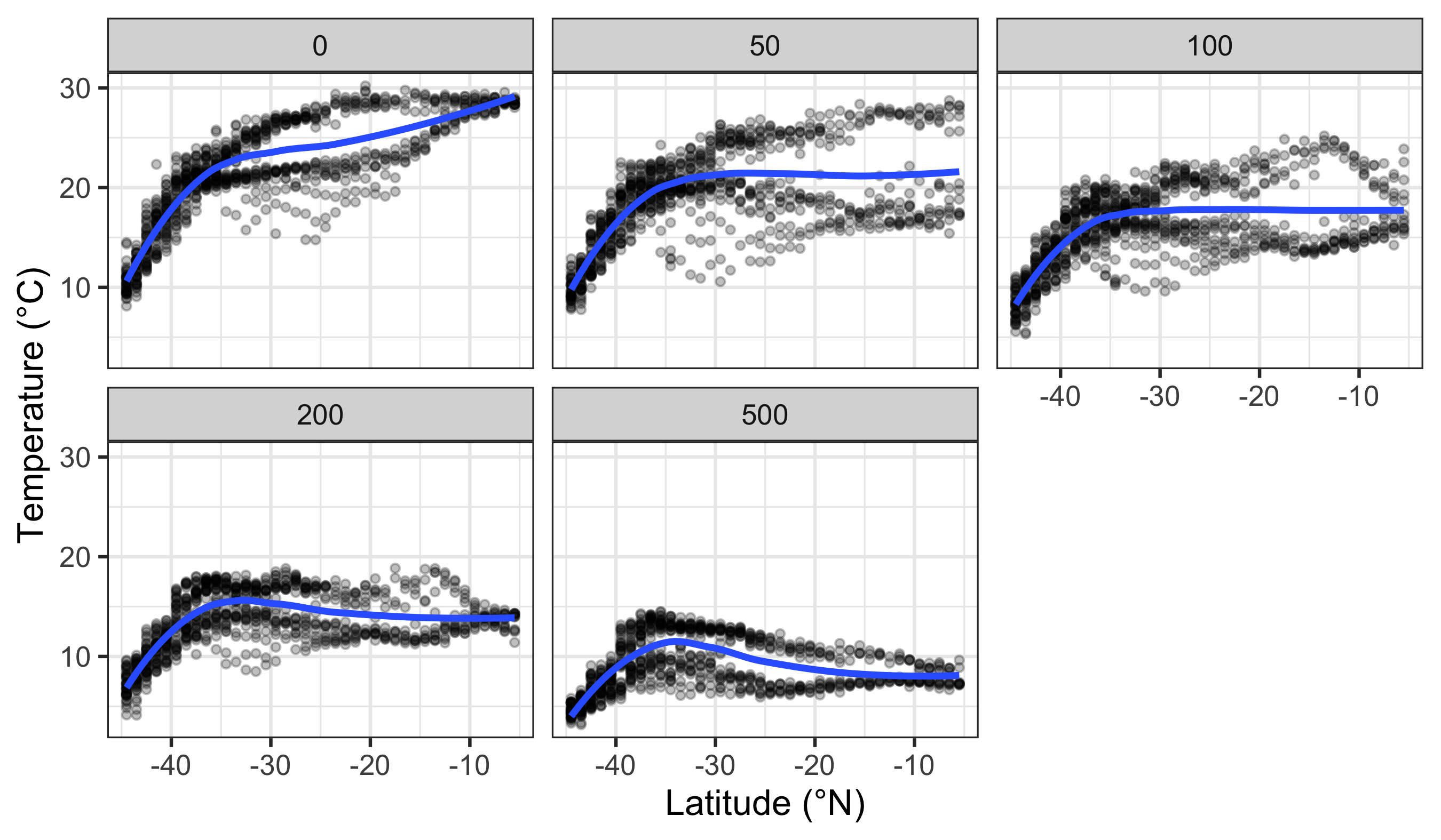
2 Faceting One Figure
Faceting a single figure is built into ggplot2 from the ground up and will work with virtually anything that could be passed to the aes() function. The key idea is that faceting splits the data into panels before any geometry or statistics are calculated. This means each panel gets its own model fit, summary, or smoothing line, based only on the subset of data in that panel.
Here we see how to facet ocean climatology data by depth and variable using the WOA18 core dataset.
facet_wrap() vs facet_grid()
Use facet_wrap() when you have one faceting variable (one-dimensional). Use facet_grid() when you want a two-dimensional layout across rows and columns (e.g., facet_grid(sex ~ diet)).
By default, facets share scales. This is often desirable for comparison, but it can mislead if one group is much larger or smaller than the others. If needed, allow free scales with scales = "free" so each panel can use its own axis ranges.
In this chapter we use a small, tidy extract of World Ocean Atlas 2018 (WOA18) climatologies for the broader Southern Africa region.
Why WOA matters in ocean science:
- Temperature and salinity are the fundamental state variables of seawater, and together shape density and stratification.
- Dissolved oxygen is a key indicator of ventilation, productivity, and habitat suitability.
- Nutrients (nitrate, phosphate, silicate) constrain primary production and structure ecosystems.
These variables are not “just numbers”: they encode the physical and biogeochemical structure of the ocean.
R> Rows: 200,382
R> Columns: 8
R> $ lat      <dbl> -44.5, -44.5, -44.5, -44.5, -44.5, -44.5, -44.5, -44.5, -44.5…
R> $ lon      <dbl> 6.5, 7.5, 9.5, 12.5, 14.5, 15.5, 19.5, 20.5, 22.5, 24.5, 26.5…
R> $ depth_m  <dbl> 0, 0, 0, 0, 0, 0, 0, 0, 0, 0, 0, 0, 0, 0, 0, 0, 0, 0, 0, 0, 0…
R> $ value    <dbl> NA, 295.308, 295.840, NA, 280.251, NA, 270.377, 270.764, 289.…
R> $ month    <dbl> 0, 0, 0, 0, 0, 0, 0, 0, 0, 0, 0, 0, 0, 0, 0, 0, 0, 0, 0, 0, 0…
R> $ variable <chr> "dissolved_oxygen", "dissolved_oxygen", "dissolved_oxygen", "…
R> $ unit     <chr> "umol/kg", "umol/kg", "umol/kg", "umol/kg", "umol/kg", "umol/…
R> $ source <chr> "WOA18 decav 1.00° CSV", "WOA18 decav 1.00° CSV", "WOA18 deca…See: data/SAMOS/processed/woa18_sa_core_1deg_monthly_DICTIONARY.md
3 New Figure Types
This section takes the current ideas forward:
- Designing individual plots as reusable objects so they can be combined later.
- Choosing plot types that match specific questions, which sometimes requires filtering or reshaping the data.
Before we can create a gridded figure of several smaller figures, we need to learn how to create a few new types of figures first. The code for these different types is shown below. Notice that we assign each plot to an object (e.g., line_1, histogram_1). This is the standard workflow for composing multi-panel figures.
Some plot types are best suited to specific questions. For example, if you want to compare final weights by diet, it makes sense to filter to the final day. That is why we create a filtered dataset for the histogram and boxplot.
3.1 Line Graph (a latitudinal transect style summary)
line_1 <- woa_feb_temp_depths %>%
  group_by(depth_m, lat) %>%
  summarise(value = mean(value, na.rm = TRUE), .groups = "drop") %>%
  ggplot(aes(x = lat, y = value, colour = factor(depth_m))) +
  geom_line(linewidth = 0.8) +
  labs(x = "Latitude (°N)", y = "Temperature (°C)", colour = "Depth (m)") +
  theme_minimal()
line_1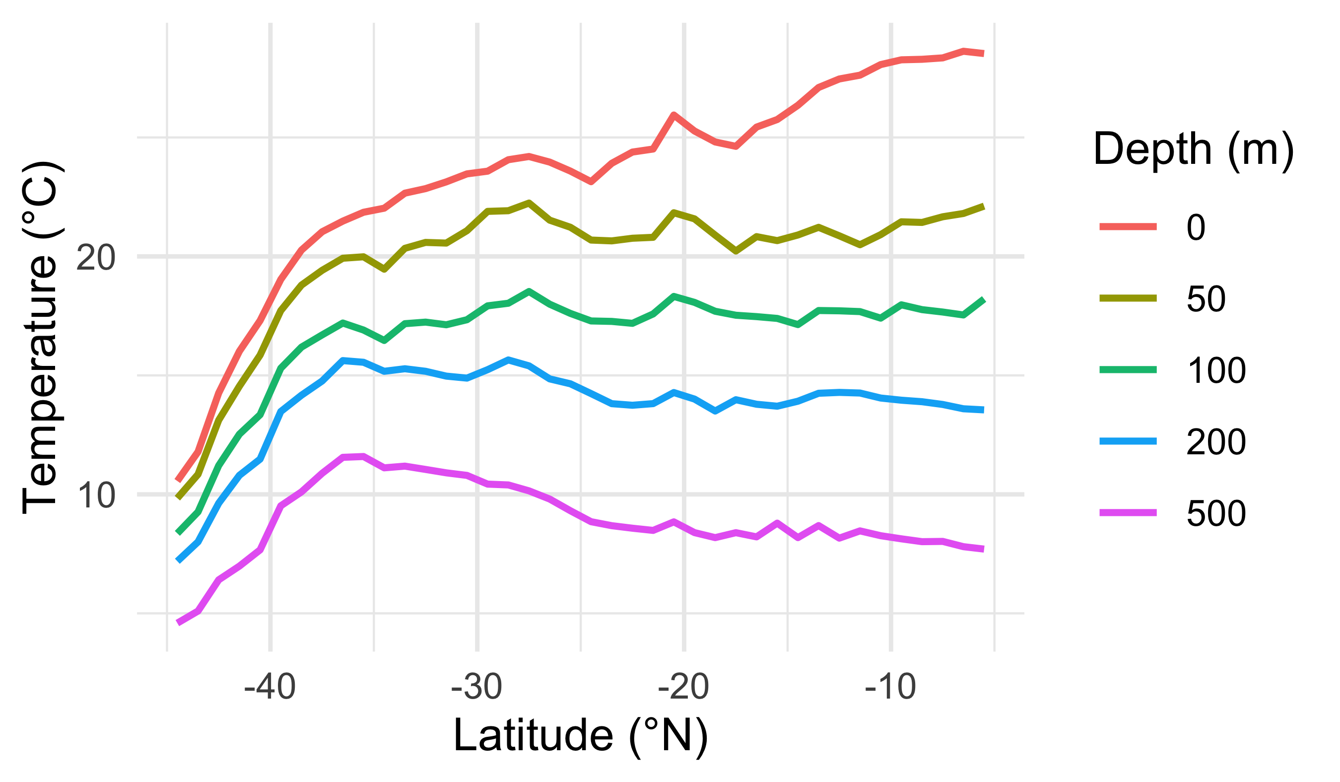
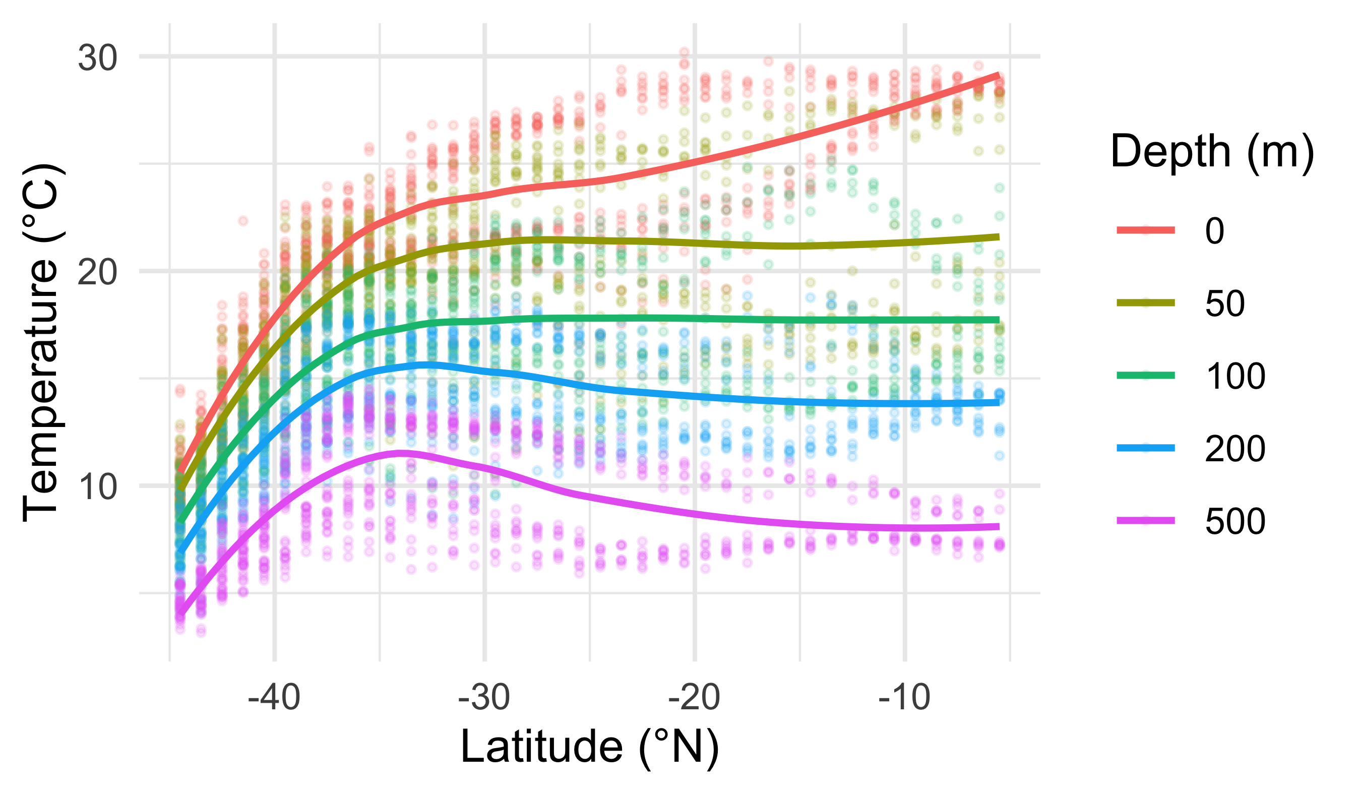
3.2 Smooth Model (LOESS)
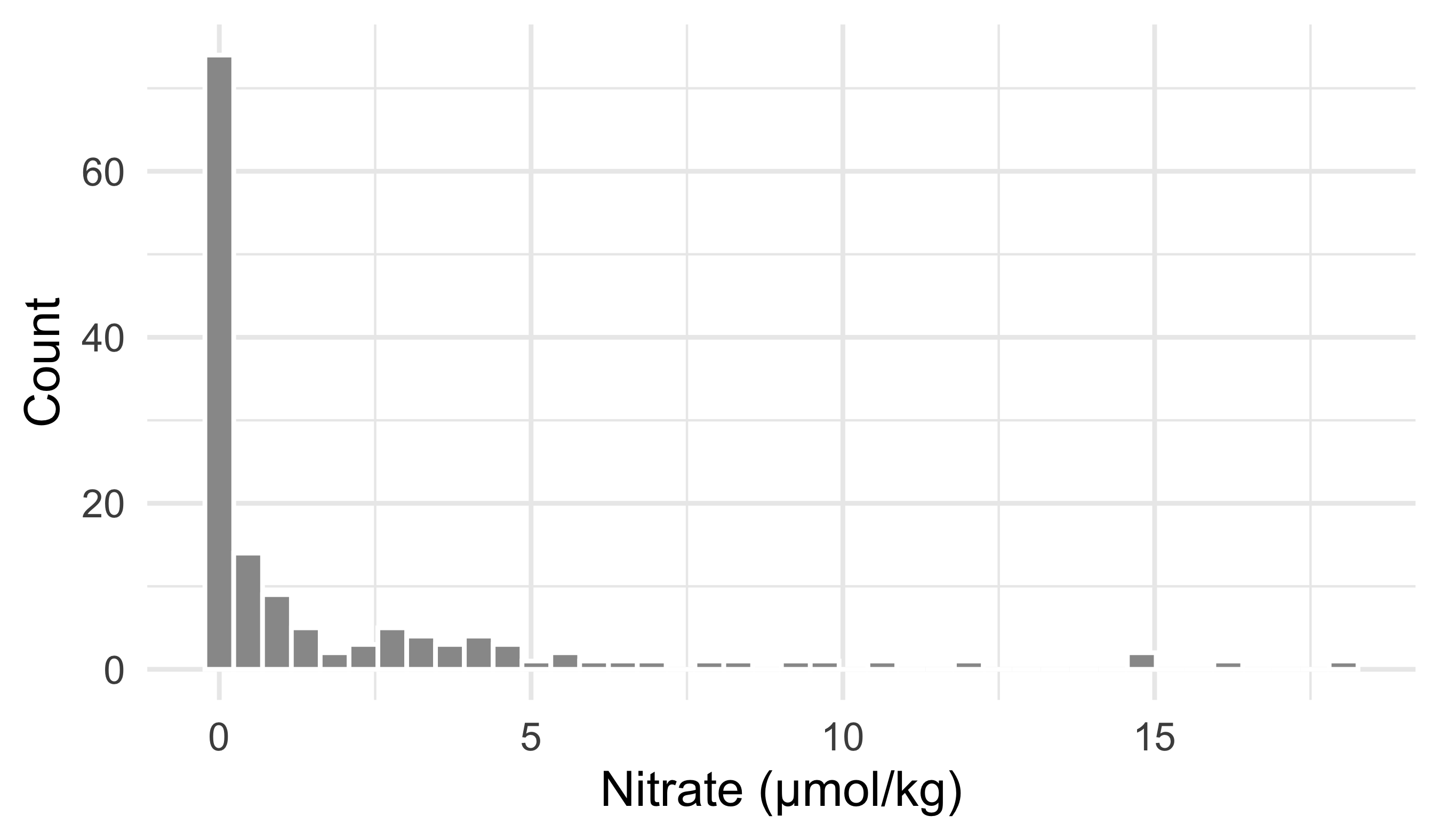
3.3 Histogram (distribution of a chemical variable)
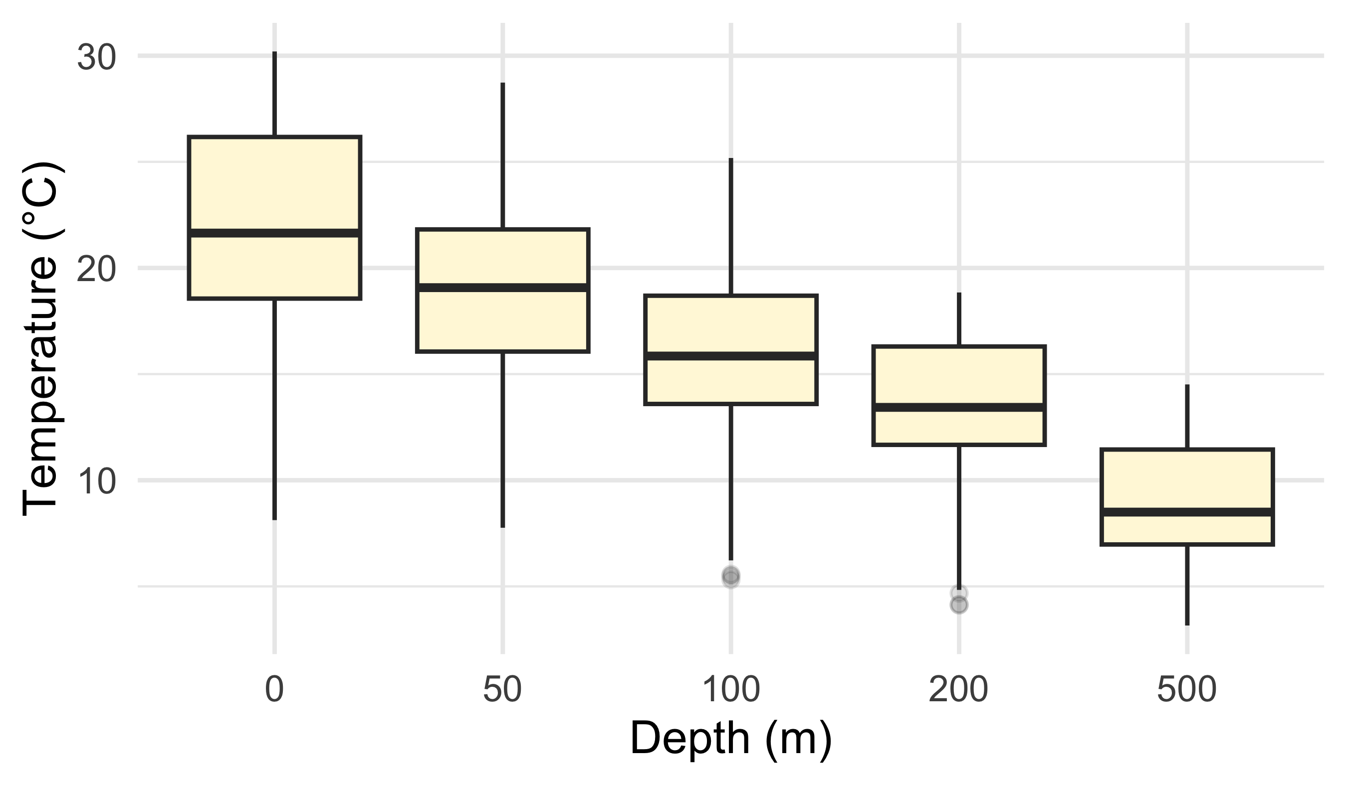
3.4 Boxplot (compare depths)
4 Gridding Figures
With these four different figures created we may now combine them. They show different views of the same ocean structure:
- broad latitudinal gradients (line + smooth)
- distribution of a nutrient at the surface (histogram)
- how temperature distributions shift with depth (boxplot)
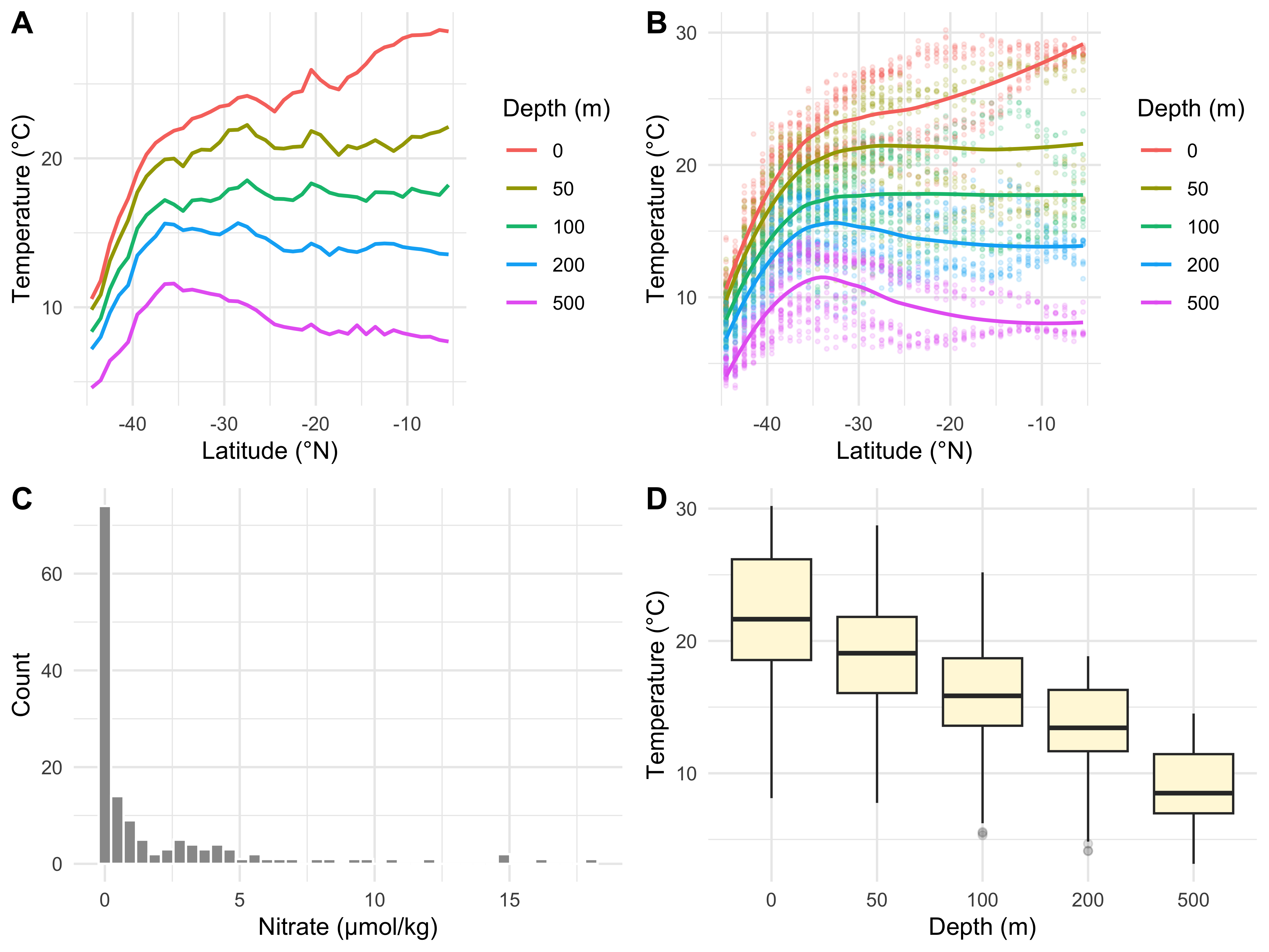
A shared legend only makes sense when panels map the same aesthetic to the same variable. Here only the first two panels use a depth legend; the histogram and boxplot do not.
If you want a common legend, design the four plots so they share mappings (for example all plots map colour = factor(depth_m)).
The figure can be saved using ggsave().
# First we must assign the code to an object name
grid_1 <- ggarrange(line_1, sm_1, histogram_1, box_1,
                    ncol = 2, nrow = 2,
                    labels = c("A", "B", "C", "D"))

# Then we save the object we created
# (make sure the folder exists)
dir.create("figures", showWarnings = FALSE)

ggsave(plot = grid_1, filename = "figures/woa_feb_summary_grid.pdf",
width = 8, height = 6, units = "in", dpi = 300)Create four new graphical data summaries that we have not seen before and create a faceted layout with the ggarrange() function as we have seen in the example provided in this chapter.
Make sure the above assignment is included within a Quarto file rendered to .html. Include some textual information to inform the reader of the intent of the plots and what patterns are visible.
Reuse
Citation
@online{a._j.2021,
  author = {A. J. , Smit},
  title = {11. {Faceting} {Figures}},
  date = {2021-01-01},
  url = {http://samos-r.netlify.app/intro_r/11-faceting.html},
  langid = {en}
}